In this quick tutorial, we will learn how to integrate Power BI reports into Power Apps, including the ability for users to filter within Power Apps which then gets reflected in the Power BI tile. You can watch the full video of this tutorial at the bottom of this blog.
Let’s dive right in and get started.
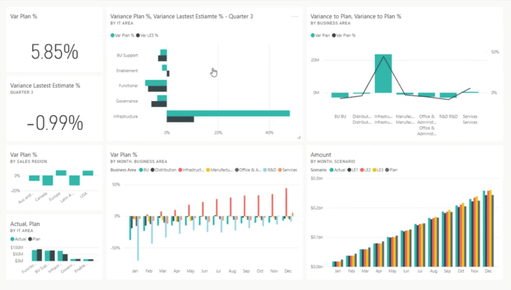
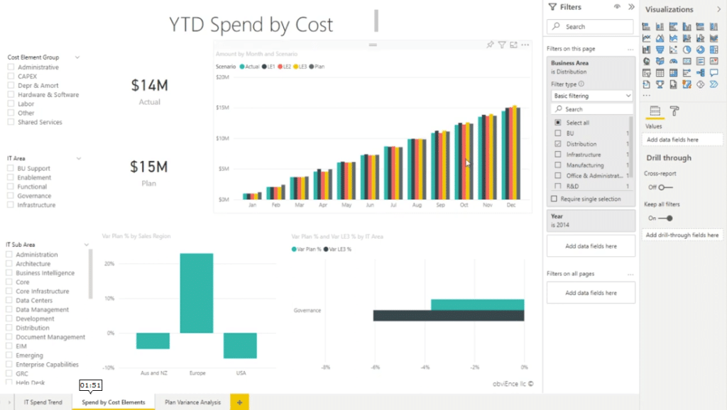
What we have is a very quick Power BI dashboard that I pulled through from sample data. It’s called the IT Spend Analysis Sample.
It has various levels of information that shows how this company spends its dollars month over month. We have it by Infrastructure, and Actual versus Plan. Also, we have an overall figure of 5.85% over budget.
Basically, we want to replicate one of these tiles over into Power Apps.
Integrating Power BI Tile Into Power Apps
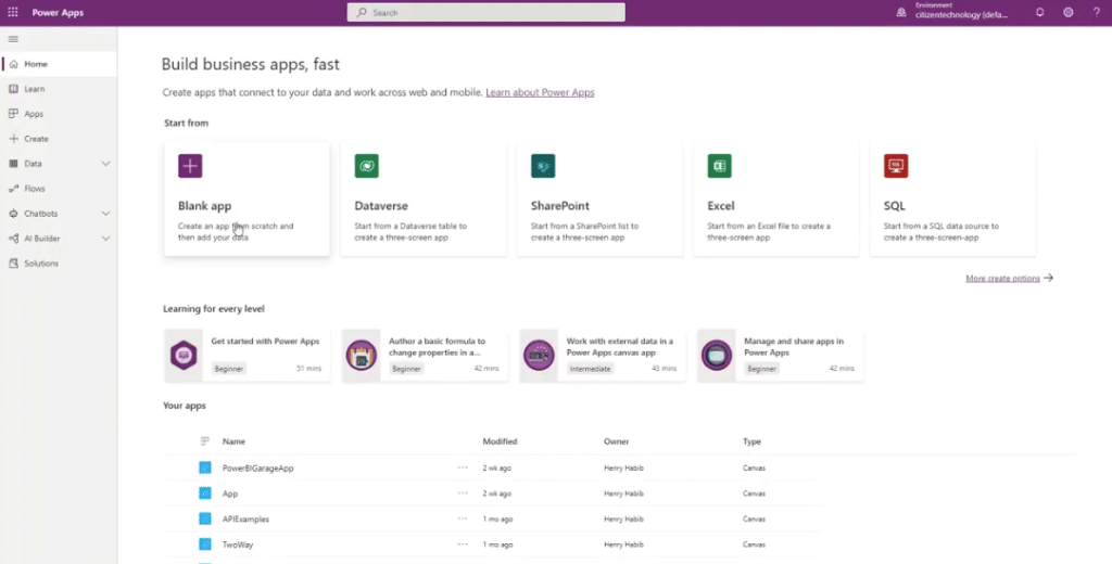
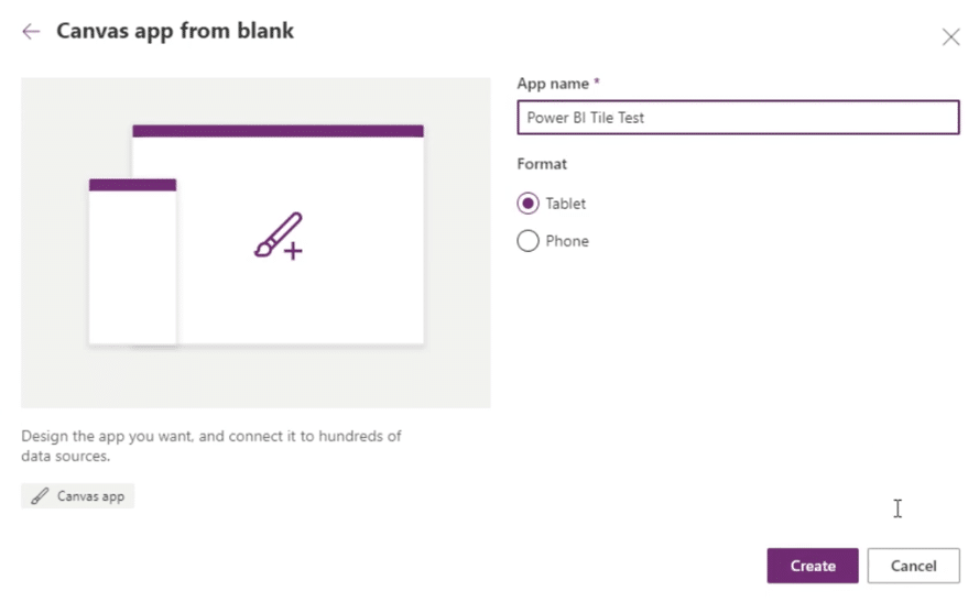
Open Power Apps to create a Blank app.
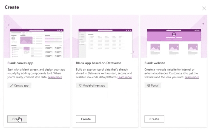
Let’s name this Power BI Tile Test, select the Tablet format, and click Create.
We’ll create a Tablet app. You can easily create a Phone app as well.
There are a few things to remember when you’re creating tiles within Power Apps.
The first one is that the tile must come from a dashboard. It can’t come from a report because dashboards are live, and it’s assumed that whatever Power BI tile you put in is live too.
Another important thing is it will show you how to add filtering capabilities, but they’re currently limited. We can only filter string-related variables, but we can’t filter numbers.
Adding The Power BI Tile
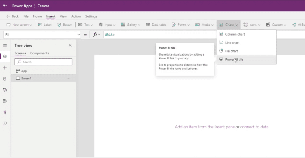
With that being said, let’s go ahead and add in our Power BI tile. Go to Insert, then go to Charts, and select the Power BI tile.
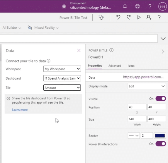
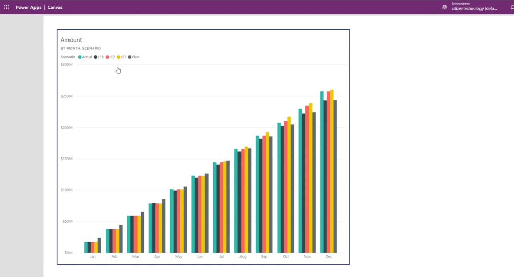
On the right-hand side, we can now choose what tile we want to bring in. The dashboard that I showed you was in My Workspace, so let’s select that. The dashboard’s name is IT Spend Analysis Sample, and then the actual Power BI tile is Amount.
We now have our Power BI tile. The nice thing about it is that it’s dynamically sized, so it fits on all screens.
If you click the Play button, it goes bigger screen and it looks great. If it’s on a phone or tablet, it looks great as well. Additionally, if you click it, it takes you back to the Power BI dashboard.
We can now add some functionality to it. Currently, this shows us the amount for actual and different scenarios for every single month for all departments, business areas, and countries.
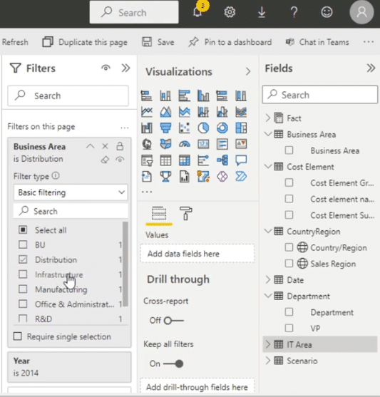
If we go to the underlying report and go to the Tables, we can filter it by Business Area, Cost Element, Country Region, Department, and more.
For our example, let’s filter it by Business Area. It comes from the table called Business Area. They just happen to be the same name.
Also, we have different examples we can choose from such as BU, Distribution. Infrastructure, and so on.
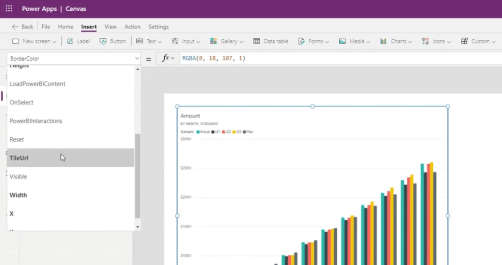
Going back to Power Apps, let’s add a filter by accessing the TileUrl properly.
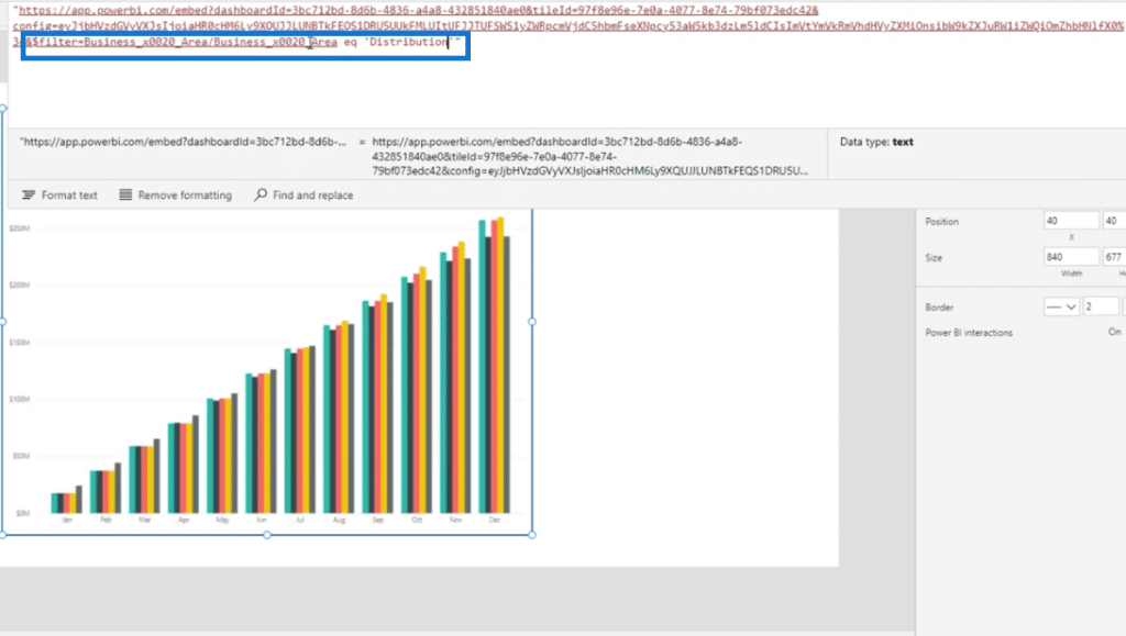
At the end of the tile URL and within the quote, let’s type in &$filter=Business_x0020_Area/Business_x0020_Area eq ‘Distribution’.
One thing to note is that Microsoft does not allow spaces hence we replaced the spaces with _x0020_. This is how Microsoft represents spaces.
Similar to the OData filter, we wrote eq, which stands for equals, and then provide a string, that’s why we used the Distribution.
OData filter is the filtering logic we use within Power Automate. In this case, we should only see sales or IT spending where the Business area is equal to Distribution.
To ensure that adding interactivity will work, we need to change the key property to AllowNewAPI.
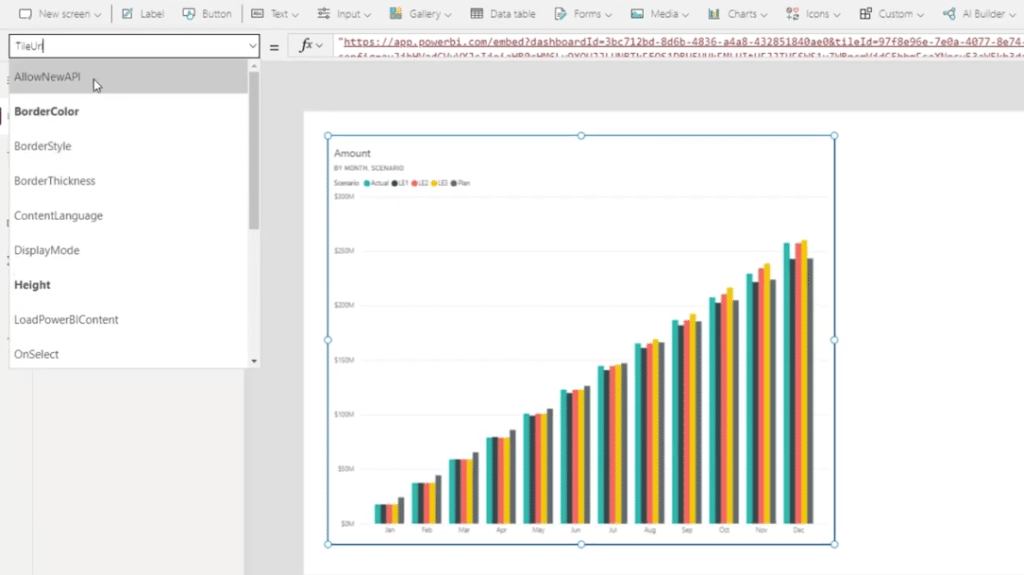
This is what tells Power Apps that it is going to be a live interactive able report, which is why we need to edit this from false to true. By doing this, it will interact with Power Apps compared to before when it was just static.

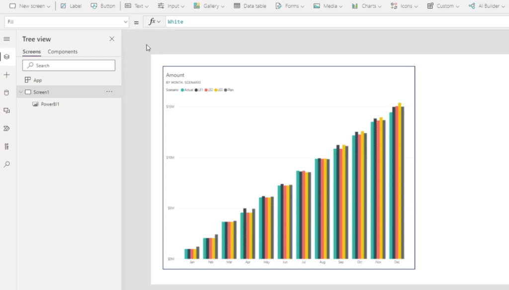
So there, it worked! It shows 15 million now which is lower than 300 million.
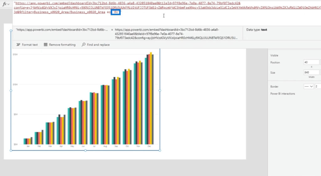
Let’s go ahead and test this by going back to TileUrl and changing it to BU.
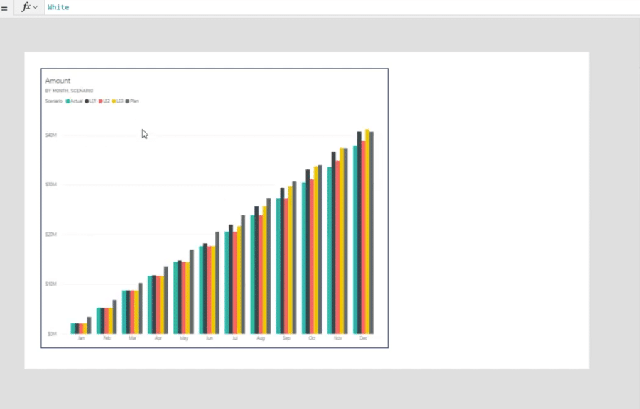
The report is being filtered from 15 million to 40 million, which is exactly what we want.
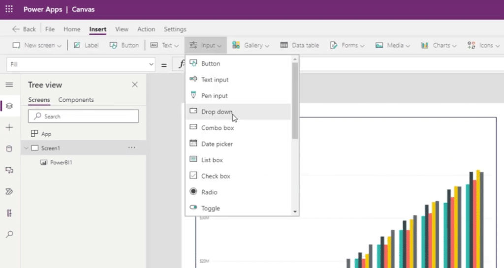
The final thing that we need is to link the filter to control within Power Apps by clicking Insert, then going to Input, and then selecting Dropdown.
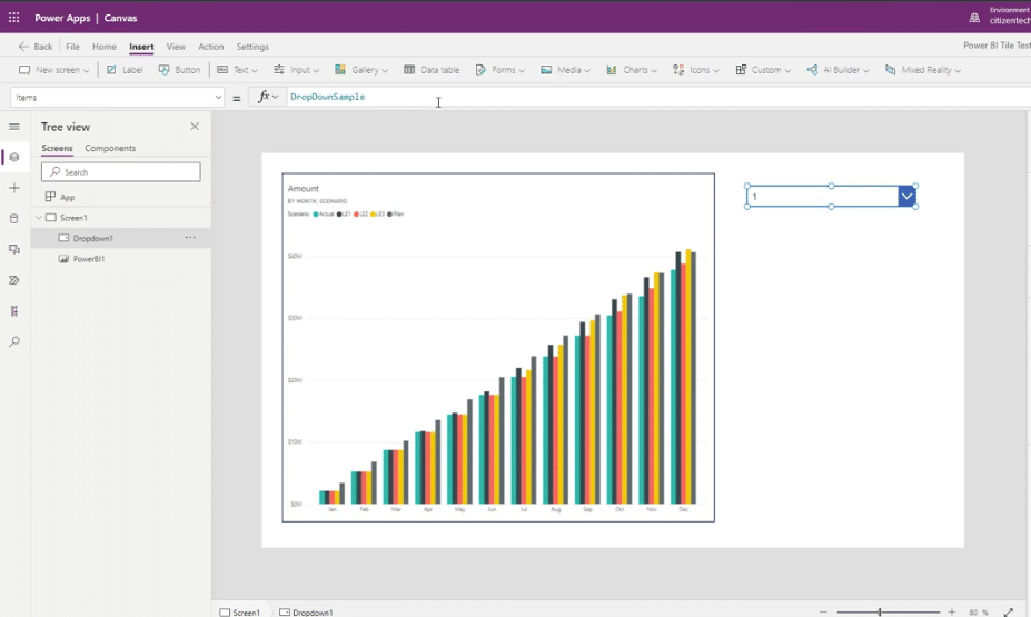
We also need to change the items from the default 1, 2, and 3 to BU, Distribution, and Infrastructure.
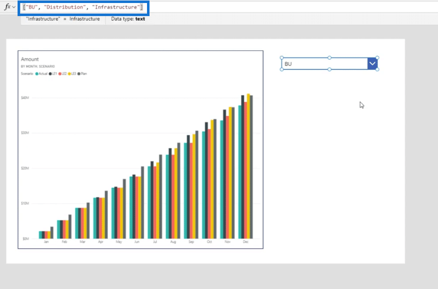
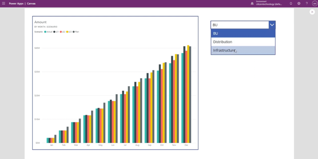
Then, click the Play button in order to toggle through these.
The next thing we need is to make sure that the tile URL is linked to this dropdown. To do that, let’s get rid of BU then add in “&Dropdown1.SelectedText.Value&.”
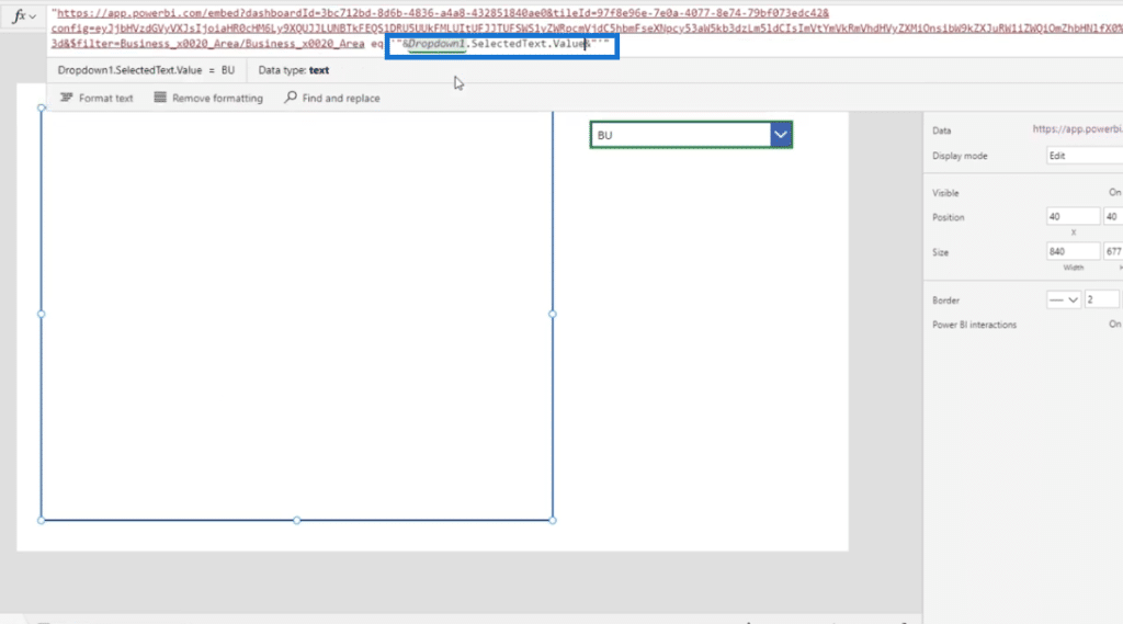
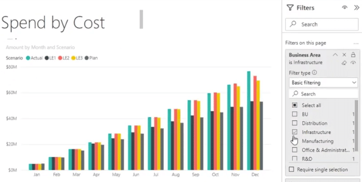
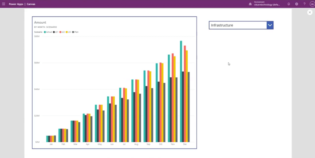
We are done creating a full interactive Power BI report within Power Apps. So if we go back to the Power BI dashboard and select the Infrastructure filter, it shows 80 million. This should be the same in Power Apps when we select it.
There you go, it worked perfectly!
***** Related Links *****
How To Use Concurrent Function In Power Apps
Power Apps Business Process Flow And Documentation
Power Apps Model Driven Apps: Site Maps And How They Work
Conclusion
In a short period of time, we were able to take a Power BI tile and put it into Power Apps. We also added interactivity to it by linking it to a filter. Hope this tutorial helps!
All the best,
Henry
[youtube https://www.https://www.youtube.com/watch?v=p64y8nSmasQ&w=784&h=441]


